Introduction
In the early days of the internet, web design was primarily focused on aesthetics and basic functionality. Today, the focus has shifted toward inclusivity. Web accessibility (often abbreviated as a11y) ensures that everyone, including people with visual, auditory, motor, or cognitive disabilities, can access and enjoy digital content. According to the World Health Organization, over 1 billion people experience some form of disability, making accessibility a fundamental requirement of modern web development rather than an afterthought.
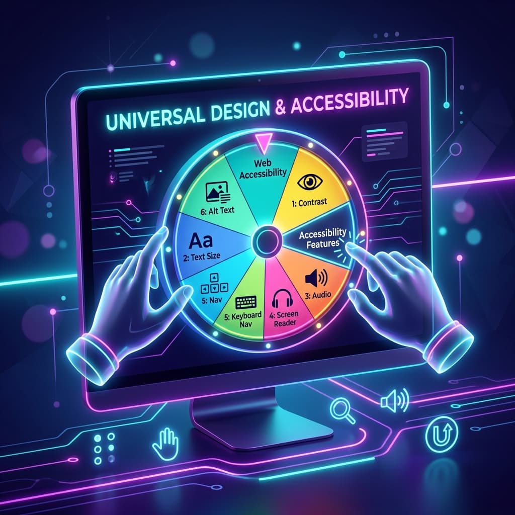
Interactive elements—like digital spin wheels, form controls, and animations—are notoriously difficult to design accessibly. Because spin wheels rely heavily on vibrant colors, rotating text, high-speed motion, and instant updates, they can easily become unusable for individuals with visual impairments, color blindness, vestibular disorders, or motor difficulties.
However, designing accessibly does not mean sacrificing visual appeal. In fact, following universal design principles often leads to a cleaner, more intuitive, and more beautiful interface for everyone.
In this comprehensive guide, we explore how to apply the Web Content Accessibility Guidelines (WCAG) to interactive spin wheels. We cover color contrast, typography, screen reader compatibility, and motion management to help you design a custom decision wheel that is both stunning and universally accessible.
1. Color Contrast & Readability: The 4.5:1 Standard
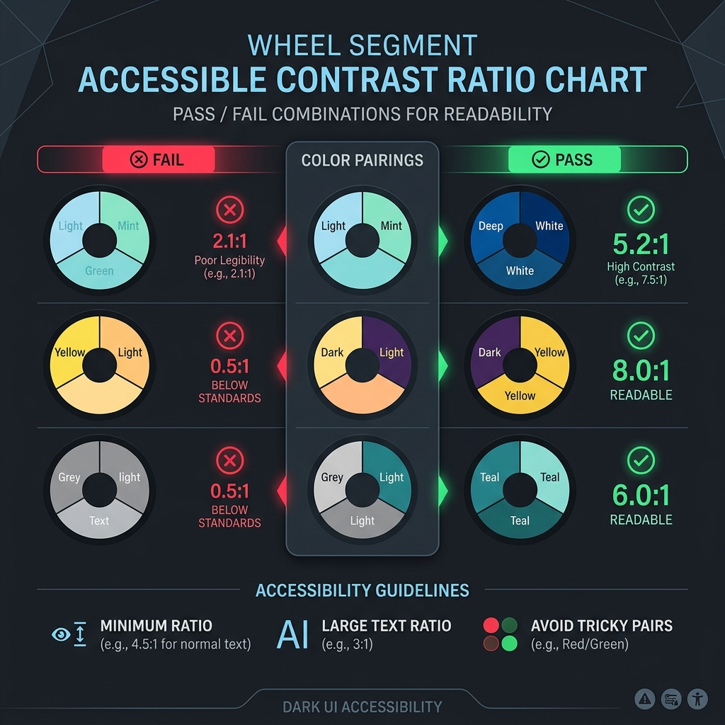
Color is the most defining feature of a spin wheel. Typically, wheels feature alternating segments of red, blue, green, and yellow to create visual excitement. However, if your color choices lack sufficient contrast, the text labels on the wheel will become illegible for users with low vision or color blindness.
The WCAG Contrast Guidelines
To comply with WCAG 2.1 AA standards, text elements must meet a minimum contrast ratio against their background:
- Normal Text (under 18pt / 24px): Must have a contrast ratio of at least 4.5:1.
- Large Text (over 18pt or bold over 14pt): Must have a contrast ratio of at least 3:1.
If you place white text (#FFFFFF) on a bright yellow segment (#FFEB3B), the contrast ratio is only 1.6:1, which fails WCAG guidelines. Conversely, placing dark gray text (#212121) on the same yellow segment yields a ratio of 16.2:1, which passes.
Designing for Color-Blind Users
Approximately 8% of men and 0.5% of women have some form of color vision deficiency (such as Deuteranopia or Protanopia, which make distinguishing red and green difficult). To ensure your wheel is accessible to these users:
- Do Not Rely on Color Alone: If you use a color-coded system to represent choices (e.g., red for "No", green for "Yes"), ensure the text labels or icons explicitly state the outcome.
- Add Distinct Borders: Place high-contrast border lines between segments to help users distinguish where one slice ends and the next begins.
- Check with Contrast Tools: Use a browser-based contrast ratio tool or color blindness simulators to audit your palettes before launching.
2. Typography: Legibility in Motion
When a digital wheel spins, the text labels rotate, tilt, and eventually stop at various angles. This makes legible typography critical.
- Use Geometric Sans-Serif Fonts: Clean, geometric sans-serif fonts (like
Inter,Plus Jakarta Sans, orGoogle Sans) are far easier to read at small sizes and tilted angles than decorative, script, or serif fonts. - Manage Text Orientation: For wheels with many slices, text is often aligned radially (pointing toward the center). Ensure your layout has enough padding to prevent letters from overlapping near the hub. Avoid rotating text entirely upside down; instead, keep labels readable horizontally or at a maximum 90-degree tilt.
- Avoid Excessive Uppercase: While uppercase text is popular for headers, all-caps strings are actually harder to scan quickly because they lack the distinct visual shapes (ascenders and descenders) of lowercase letters. Use sentence case or title case for slice labels.
- Dynamic Text Scaling: If a user enters a very long word, the text size should automatically scale down to fit inside the segment boundaries without spilling over or clipping.
3. Keyboard Navigation & Assistive Technologies (ARIA)
A major barrier to web accessibility is assuming that all users navigate using a computer mouse. Individuals with motor disabilities, tremors, or visual impairments often rely exclusively on keyboards or screen readers.
Implementing Keyboard Controls
A keyboard-accessible spin wheel should support the following key interactions:
- Focus Management: The "Spin" button must be focusable using the standard
Tabkey. It should feature a highly visible focus outline (usually a bright border or ring) so keyboard users know where they are on the page. - Action Keys: Pressing the
SpacebarorEnterkey while the button is focused should trigger the wheel spin. - Settings Control: Users should be able to navigate form inputs (adding names, selecting themes) using arrow keys and checkboxes.
Designing for Screen Readers (ARIA)
Because a spin wheel is highly visual, blind or low-vision users rely on screen readers to describe what is happening. Use HTML5 semantic markup and ARIA (Accessible Rich Internet Applications) attributes to make your spinner screen-reader friendly:
- Use
aria-liveregions: When the wheel starts spinning, the screen reader should announce: "Wheel is spinning...". When it stops, it should announce the winning result: "Winner: Choice A". This is done by outputting the result text into a container witharia-live="polite"oraria-live="assertive". - Provide text alternatives: If the wheel uses images instead of text labels, ensure every image has descriptive
alttext. - Label interactive controls: Ensure buttons have descriptive labels (e.g.,
aria-label="Spin the wheel").
4. Motion Management: Supporting Vestibular Health
Animations make websites feel dynamic and alive, but they can pose serious health risks for some users. High-speed spinning, flashing lights, or sudden zooming animations can trigger dizziness, nausea, headaches, or even seizures in individuals with vestibular disorders or photosensitive epilepsy.
Respecting User Settings (`prefers-reduced-motion`)
Modern operating systems allow users to check a setting named "Reduce Motion" to turn off animations. Web designers can detect this setting using the CSS media query prefers-reduced-motion:
@media (prefers-reduced-motion: reduce) {
  /* Stop the spin animation or replace it with a fade-in transition */
  .wheel-spinner {
    transition: none !important;
    animation: none !important;
  }
}
Implementing "Instant Reveal" Mode
For users who have reduced-motion enabled, you should bypass the 5-second deceleration spin animation. Instead, when they click "Spin":
- Display a brief loading indicator or a simple fade transition.
- Jump instantly to the winning slice.
- Announce the winner via the screen reader.
This allows all users to access the utility of the wheel without being exposed to triggering motion patterns.
5. Touch Target Sizes: Mobile-First UX
Digital wheels are frequently spun on smartphones and tablets. If interactive buttons are too small or placed too close together, users with limited dexterity or large fingers will struggle to use them.
- Touch Target Minimums: Ensure all clickable controls (such as the spin button, close modals, or settings tabs) have a minimum size of 48x48 physical pixels.
- Adequate Spacing: Leave at least 8px of empty space between touch targets to prevent accidental clicks.
- Accessible Forms: The input fields where users type lists of names must have large fonts (at least 16px to prevent iOS Safari from automatically zooming in and disrupting the page layout).
Summary
Web design is at its best when it is inclusive. By applying these design guidelines to your interactive spin wheels, you ensure that every participant can join in the fun—whether they are playing a classroom game, participating in a social media raffle, or using a random name generator to make decisions.
Remember that accessibility is not a checklist of rules that makes websites boring. By prioritizing color contrast, clean typography, keyboard support, and motion safety, you create a cleaner, faster, and more robust user interface that benefits everyone. Start designing with accessibility in mind, and let everyone spin!